
Tuesday, 19 May 2015
Final Piece
For my final book cover and double page spreads I decided to use a water colour process as it is a common sight in children's publishing, and I was confident I could pull off some eerie and creepy looking results using such a traditional method.
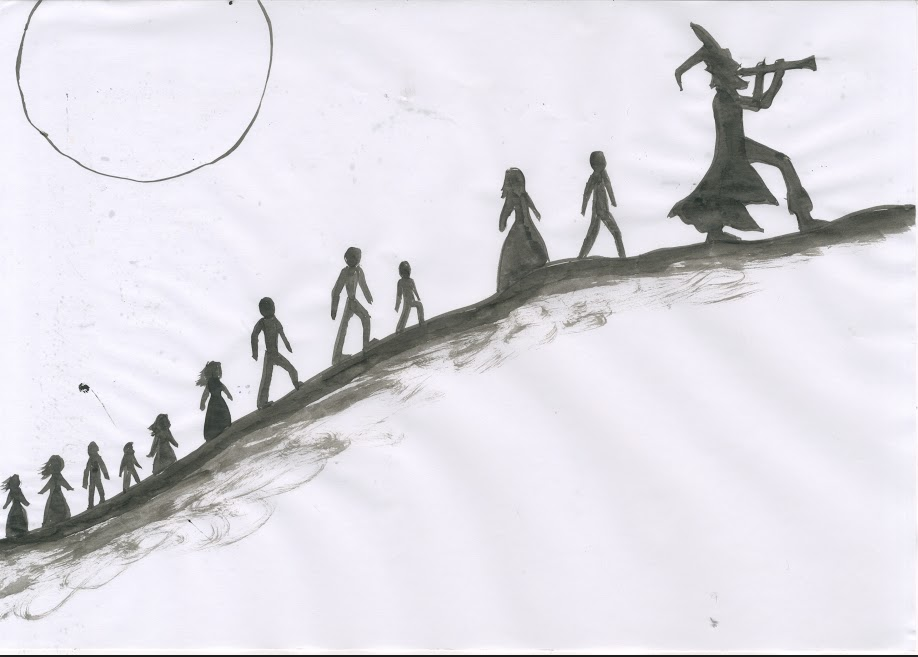
I started with the drawings in pencil, then later also traced the lines with ink to have cartoony style line that would define detail in the image.
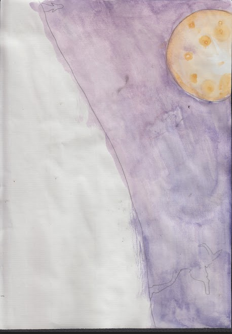
Next step was water colour. I used mostly contrasting colours to convey light and dark tones e.g. blue and orange and yellow and purple.
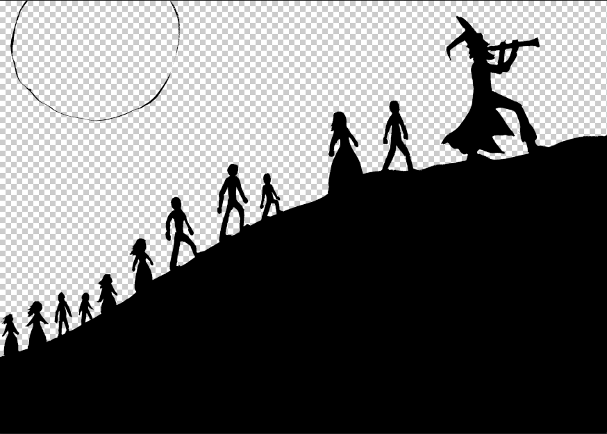
Next stage was to add the two images together in Photoshop, I used the magic wand tool to delete all of the white areas and then places the black lines over the water colour image.
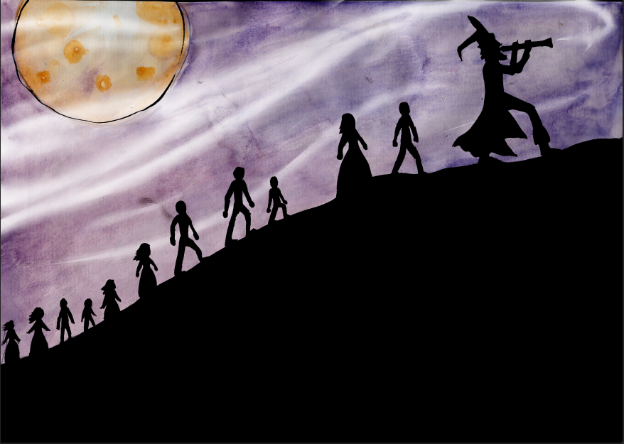
Here is the result of the two images being merged together.
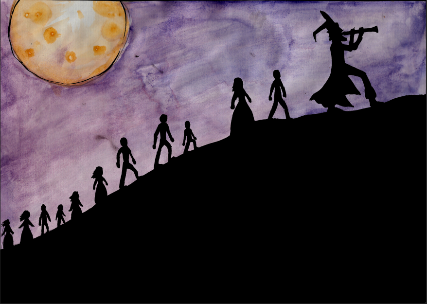
The next thing I wanted to do in this next image was add some sort of musical aura being released from the Pipers pipe and trailing behind him, luring the children with his song. I used a soft brush tool set to a low opacity to do this.
The next stage was the finishing stage of dding text, In this example the hill that the piper and the children were walking up made an excellent area to put body text.
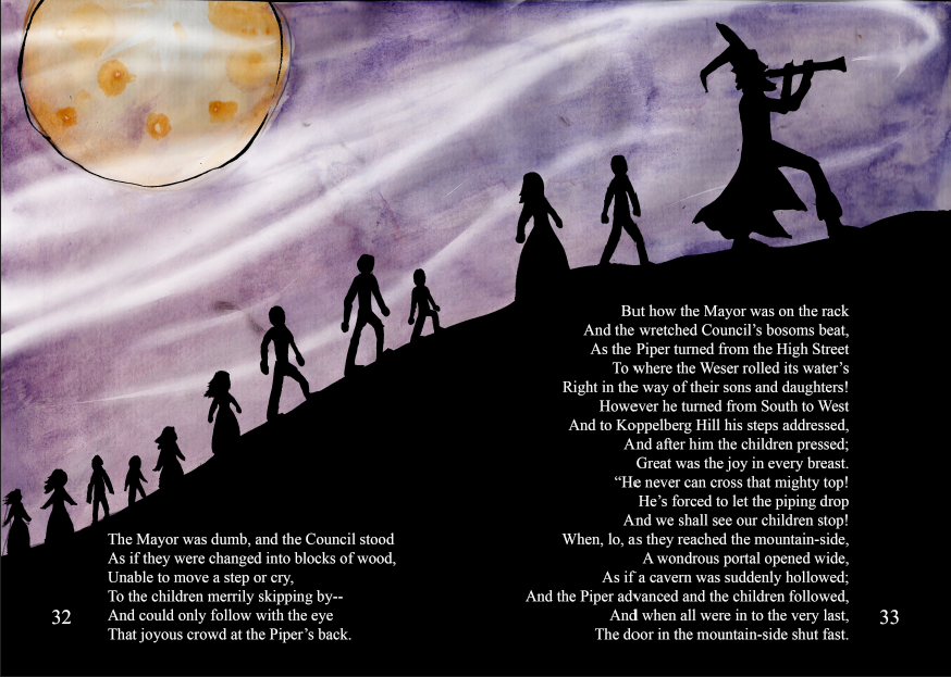
This process was the same for the other double page spread I have created along with the front cover for this book.
Here are the final finished Pied Piper book cover and double page spreads.


Monday, 18 May 2015


Tuesday, 28 April 2015
Experiment 2 - Digital shading and editing
As a second experiment I decided to try out way using Digital Art. I used drawing software mixed with photoshop to add the shading and darker tones. By only adding darker tones, I was able to produce a contrast between the pipers face being pale and almost white, and the Rats face being a darker shade of grey. This monotone shading also allowed me to add a pipe in the centre of the image to act as a spine for the book cover, but to give this pipe more of an impact and separate he two faces, I added colour to the pipe and also gave it a outer glow effect coloured red to symbolise the horrific nature of the story.
.jpg)
Using Digital software can sometimes be a good way of producing amazing artistic effects, however I feel that this is not the best way for me to produce my final piece. My last technique of using watercolour I feel was a better suited way of adding shading and colour as it gave the artwork a traditional and i'm sure and eerie feel if I try hard enough. So I feel as though watercolour is the way forward for my final book.
Colour choices
In order to play around with colours and get an Idea of what I will include in my final, I expeimented with colour choices using the areas of colour such as Monochromatic, Triadic and Analogous.
Subscribe to:
Comments (Atom)