Wednesday, 18 March 2015

Emulation

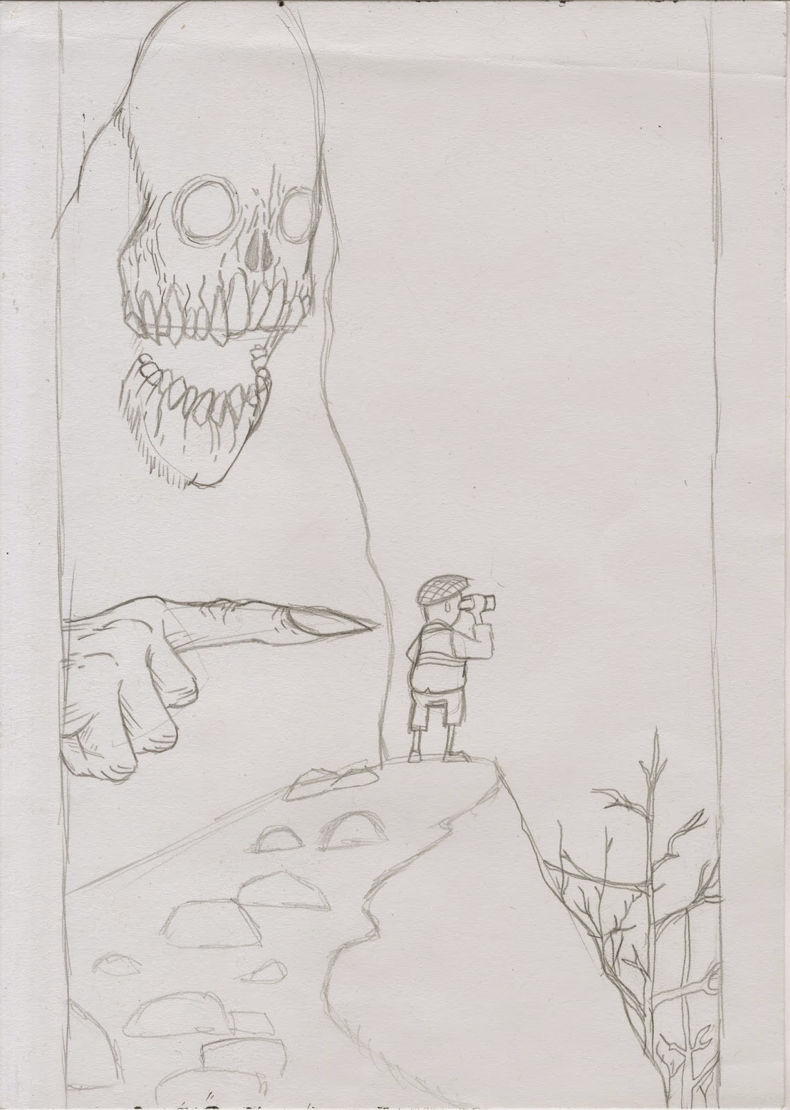
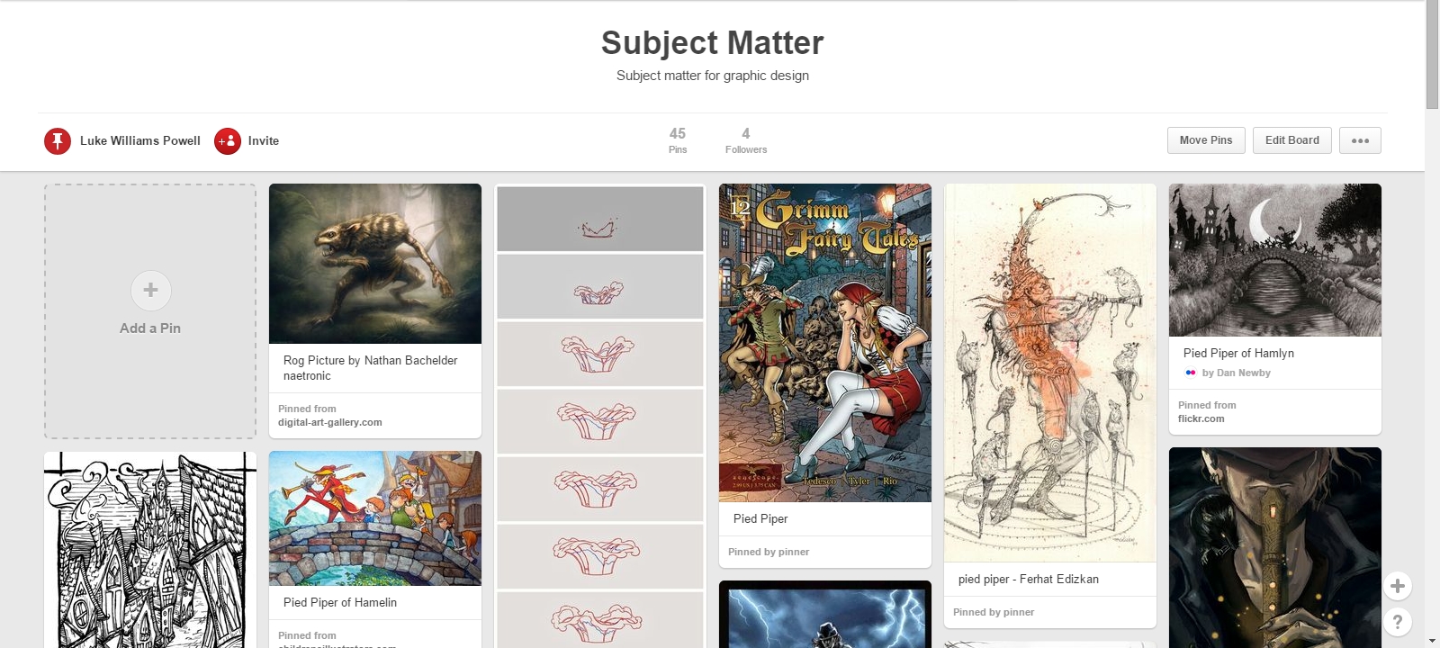
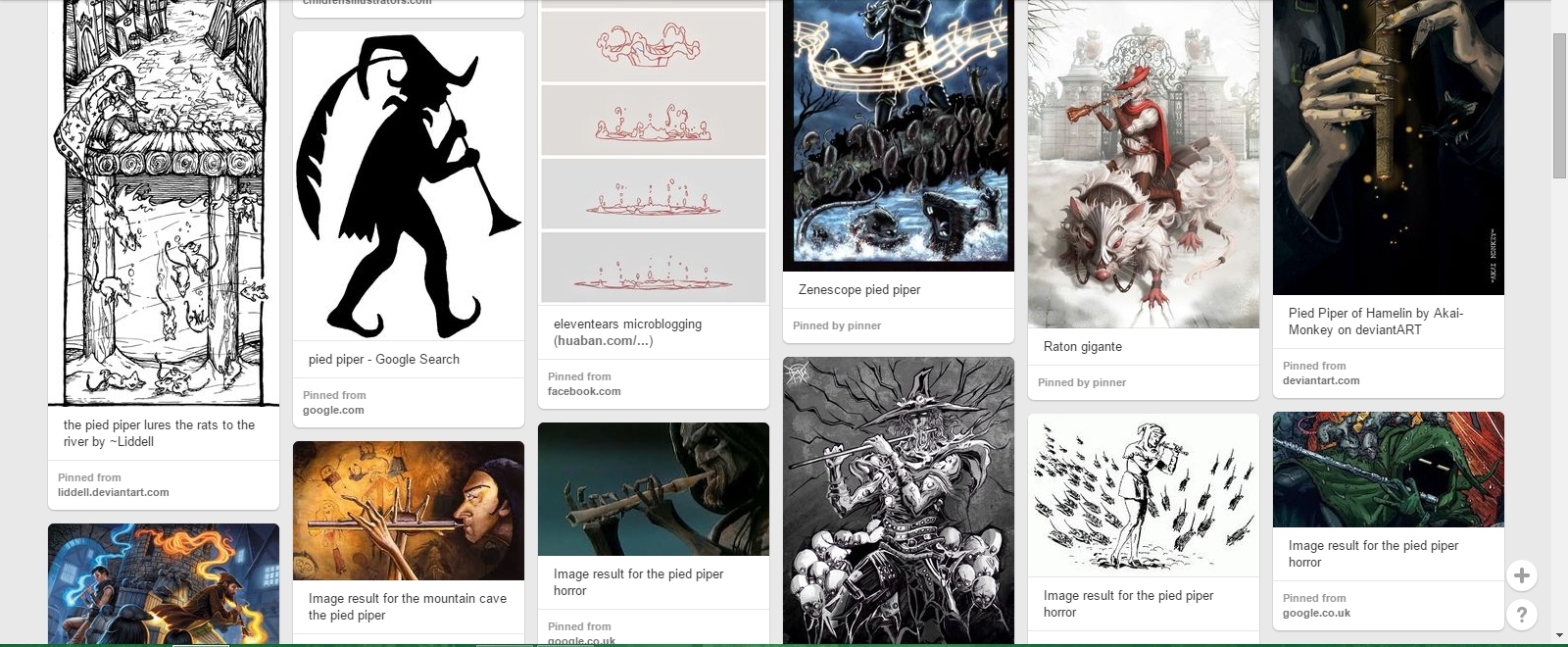
As an Emulation of edward goreys work I had perviously copied, I decided I would do something in context with the Pied Piper, so I based the whole emulation around one of the key features of the book, Rats. Edward gorey himself actually used overly exaggerated monsters that were gigantic in size and had eerie pale eyes. So I designed something similar to that but using a huse rat standing over the Piper, surrounded by the buildings of Hamelin, the setting of the Pied Piper story.


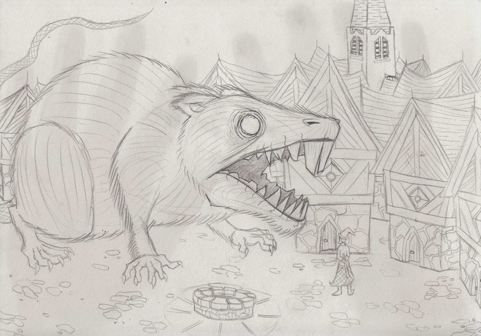
The next step here was to trace the pencil image with ink using a light pad and a dip pen, the same inking technique tat I had used when making the Edward Gorey copy.
During the inking process I did make a small error wit the sky. I thought that using a similar hatching tecnique that I used with the sky for the copy. Unfortunately, the cross hatching in the sky made the whole image look messy, and so I decided that I would have to edit the sky out using photoshop.


While in Photoshop, I made a few edits that were aimed at making the whole image seem real and add depth. I began by thresholding the image so that all of the black lines were clear and stood out. I then seperated the image of the Rat, Well and even the Piper from the rest of the image onto new layers. I then lowered the opacity of the the background layer containing the buildings in order to make them seem further away than the rest of the image. I also left the Well and Piper at high opacitys because they were both closer to the foreground and key features of the image.


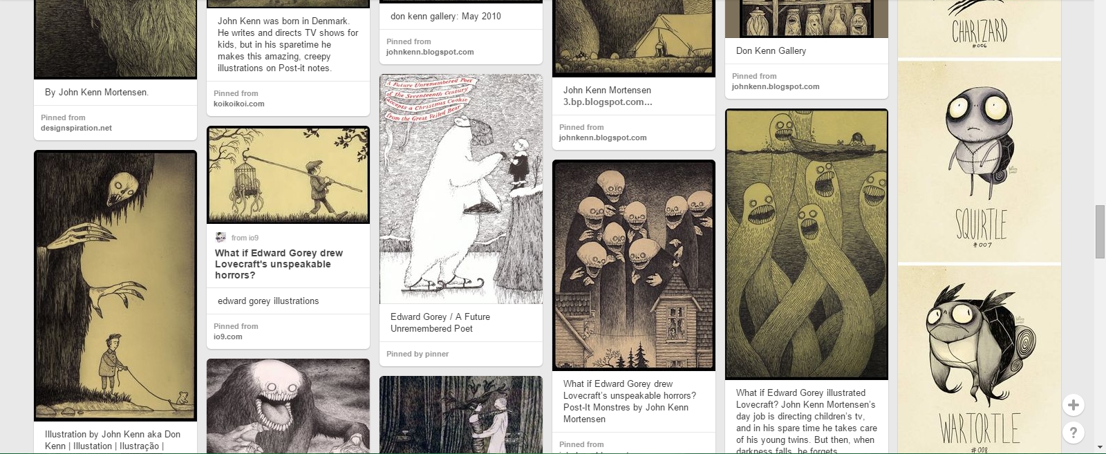
The Edward Gorey style is now one of my favourte eerie rawing styles, and wil definetly play a part in my final piece.

Monday, 16 March 2015

Type Choice - My Designs

The digital calligraphy fonts found on Pinterest and Dafont Inspired me to get a calligraphy pen and some ink and attempt at giving the style a go myself. I started by drawing out the alphabet in both upper and lower case using the calligraphy pen.


By doing this I got a feel for using the calligraphy pen and decided to practace further by re-writing the title of the book, The Pied Piper. Unfortunately in the process I did make mistakes by accidentally switching words around, but when it came to editing later on, these mistakes were easily correctable.


This last image above it the style I was more or less aiming at, therefore it was the type I used when creating my final finished title.
When In photoshop I used the lasso tool to arrange the letters and words, I used the threshold edit to make the type darker and also the eraser tool to alter certain mistakes I had made with the calligraphy pen.
I also Placed the title into Adobe Illustrator in order to make much more detailed edits to the type that would make it look much more crisper and cleaner.


Once I had cleaned up the small mistakes in the lines of the title, I experimented around with some of the pre-set brush settings in Adobe Illustrator to see whether any of the brush effects would make it look any nicer.


Most of these brush effects worked well and made the title look rather rough and creepy in some cases. but it seemed to me that the titles lost their hand written charm and almost spoilt the effect i wanted. Therefor, I have decoded that I wont use one of these brush effects, and I will just use the plain title of the Pied Piper. 


Tuesday, 10 March 2015

Type Choice - Digital

In order to find suitable digital type faces I created a Pin board on Pinterest where I can collect different designs of type that are of an interesting style and possibly fit my genre of work. 
I came across a pin of a calligraphy type face that I felt was suitable for my own, so I went onto Dafont and searched for other calligraphy fonts.


The fonts that I found on Dafont were: 

Gourdie Cursive Deux

Last King Quest

CalligraPhillip

Feathergraphy

I will take aspects of these styles of font and apply them to my own style of font. A script typeface like this however is not suitable for body text in my book, therefore this typeface can only be used for the book title on the cover. I will use an Oldstyle font for the body text of my book, as it is a much easier typeface to read.

Copy - Edward Gorey


For an artists copy I chose to look towards artists that share the same creepy style I'm aiming for in my own work. 
I already knew of the film maker and director Tim Burton, who is well known in the film industry for his eerie style and creepy stories such as  Corps Bride, Sweeney Todd, Sleepy Hollow and The Nightmare Before Christmas. 
I did some research on his work and found out that Tim Burton's work and unsettling style is inspired by the work of the late Edward Gorey.
Edward Gorey created many different pieces of work all in this style, so I searched for his work on Pinterest, and pinned as many pieces as I could find that I liked onto my inspirations board.
This photo below was the piece that stood out to me the most, so I decided that this was going to be the piece of art I would copy and develop the style myself.

To begin with I started by drawing the basic shapes of the image such as the head, hand and body shape of the creature, and the hill, trees, rocks and man in the rest of the image.
The were the main elements of the photo that I could work around when it came to using the ink.


The next step was using ink and a dip pen on a light pad to create the quick black lines that Edward Gorey's style revolved around. This would give the impression of hair, grass and the curved scratchy lines that emulated dark clouds in the sky.


This was the Image once I had finished inking. This was then taken into Photoshop in order to add some finishing touches.


In Photoshop, I cropped the image to fit better, introduced a photo filter in order to get a yellowed paper effect, altered the levels and also added a black border to the edge of the image to make the whole piece pop out t you.


Original Edward Gorey.                                                           My Finished Copy.

Sunday, 1 March 2015