
Tuesday, 19 May 2015
Final Piece
For my final book cover and double page spreads I decided to use a water colour process as it is a common sight in children's publishing, and I was confident I could pull off some eerie and creepy looking results using such a traditional method.
I started with the drawings in pencil, then later also traced the lines with ink to have cartoony style line that would define detail in the image.
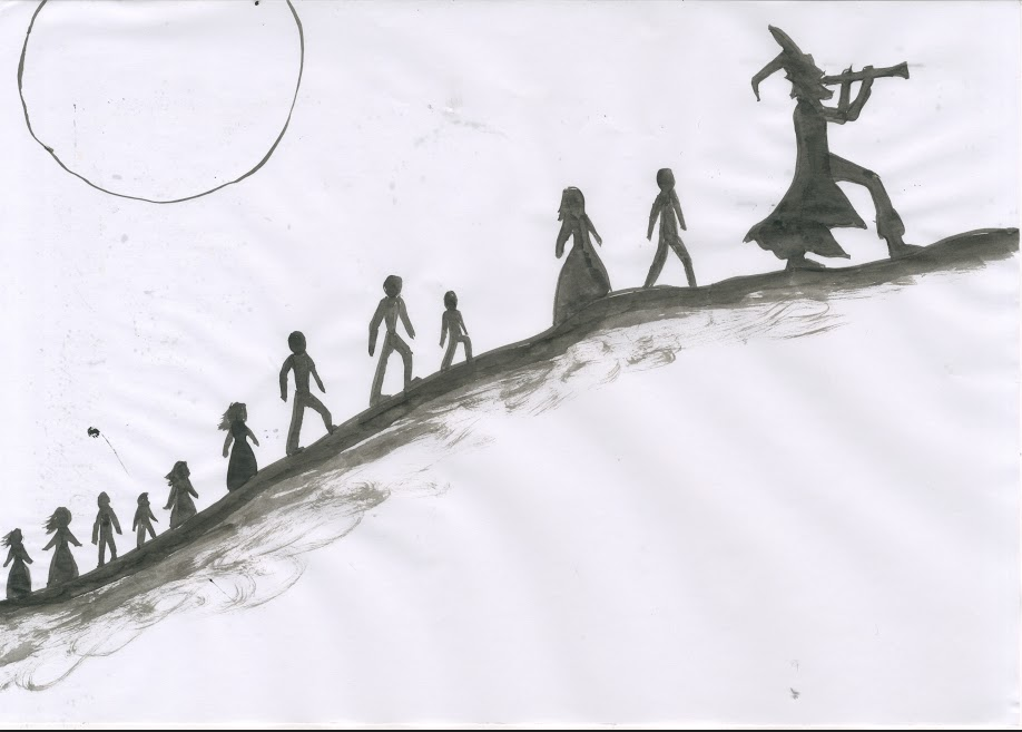
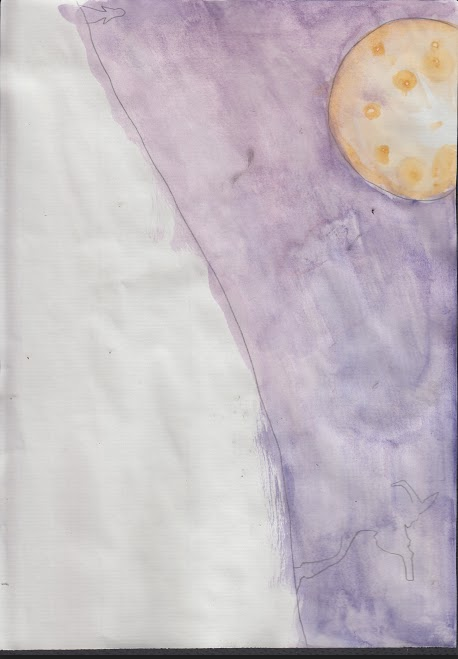
Next step was water colour. I used mostly contrasting colours to convey light and dark tones e.g. blue and orange and yellow and purple.
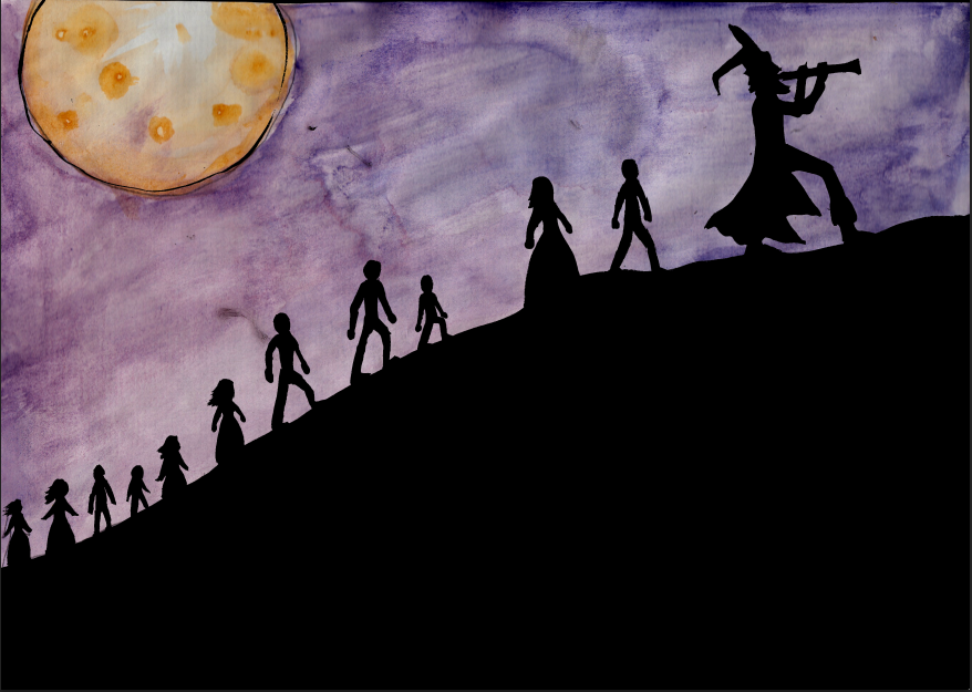
Next stage was to add the two images together in Photoshop, I used the magic wand tool to delete all of the white areas and then places the black lines over the water colour image.
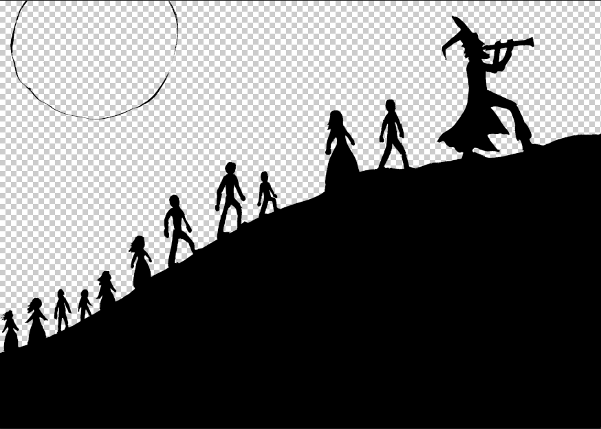
Here is the result of the two images being merged together.
The next thing I wanted to do in this next image was add some sort of musical aura being released from the Pipers pipe and trailing behind him, luring the children with his song. I used a soft brush tool set to a low opacity to do this.
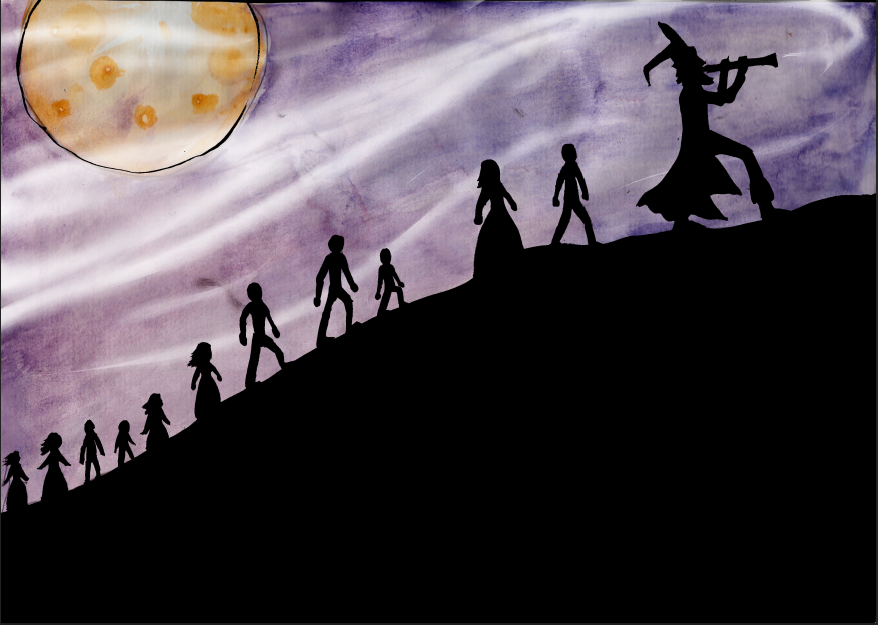
The next stage was the finishing stage of dding text, In this example the hill that the piper and the children were walking up made an excellent area to put body text.
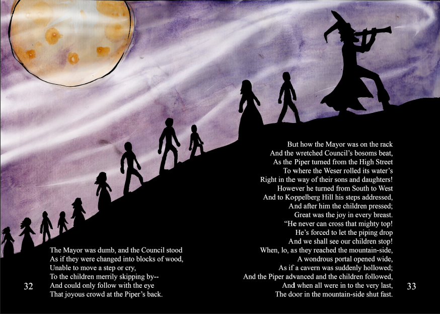
This process was the same for the other double page spread I have created along with the front cover for this book.
Here are the final finished Pied Piper book cover and double page spreads.


Monday, 18 May 2015


Tuesday, 28 April 2015
Experiment 2 - Digital shading and editing
As a second experiment I decided to try out way using Digital Art. I used drawing software mixed with photoshop to add the shading and darker tones. By only adding darker tones, I was able to produce a contrast between the pipers face being pale and almost white, and the Rats face being a darker shade of grey. This monotone shading also allowed me to add a pipe in the centre of the image to act as a spine for the book cover, but to give this pipe more of an impact and separate he two faces, I added colour to the pipe and also gave it a outer glow effect coloured red to symbolise the horrific nature of the story.
.jpg)
Using Digital software can sometimes be a good way of producing amazing artistic effects, however I feel that this is not the best way for me to produce my final piece. My last technique of using watercolour I feel was a better suited way of adding shading and colour as it gave the artwork a traditional and i'm sure and eerie feel if I try hard enough. So I feel as though watercolour is the way forward for my final book.
Colour choices
In order to play around with colours and get an Idea of what I will include in my final, I expeimented with colour choices using the areas of colour such as Monochromatic, Triadic and Analogous.
Final Draft
After developing my scamp of the split faces of the pied piper and a huge rat both spanning the front and back covers, I needed to refine the Idea further and using photoshop and drawing software to add colour and get an Idea of what colour pallets I will need to use to make the drawing look the best it could possibly be, whilst keeping true to the story and genre of the book I want to create.

The colours needed to be a mixture of desaturated colours for the rat and the pipers skin, and saturated bright colours for areas such as the eyes and the pipers clothes. The method I used to add colour was digital art, although I like this method, I feel that this book could do with a much more traditional technique of colouring, possibly water colours like I used in my previous experiment.
This is the final draft that I will use as guidance for when it comes to my final.
Wednesday, 22 April 2015
Second Emulation/Experiment - Using Watercolour
For my second emulation, I wanted add colour to my work this time but I wanted to use another form of colouring rather than just digital. I thought Watercolour would be a suitable starting point, as watercolour paints can give some very beautiful and traditional effects to work, and I was sure I could produce some creepy/eerie looking work using them.
I wanted the image to link to the story of the pied piper, so I decided to draw one of the scenes from it. The scene I chose was where the Piper enters into the council chamber with the mayor and corporation sitting at a council table discussing the rat infestation.
I started the process by drawing a pencil line drawing that I could perfect my design on. I decided to set the scene using a design based around the camera shot angle of an over shoulder shot, although decided to base the image around the side angle of the Pied Piper, and have the Mayor and Corporation sitting in the background around the table.

I started the process by drawing a pencil line drawing that I could perfect my design on. I decided to set the scene using a design based around the camera shot angle of an over shoulder shot, although decided to base the image around the side angle of the Pied Piper, and have the Mayor and Corporation sitting in the background around the table.
Now, I decided that if I used purely watercolour I would lose detail in areas such as the faces and hands. I came up with a solution for this by tracing the line work image onto another piece of paper using ink and a brush. This would then let me define more detail, and the colours that would have run into each other during the painting process would be defined between the lines and give the whole image a unique and cartoony style.

Next step was to start watercolour on the pencil drawing. I wanted to separate light and dark tones in a way that gave the impression of true lighting. I did this by using the complimentary colours Blue (to show the shadows) and Orange (for the lighter areas). This made the room look dark, but also gave the appearance of light coming through the window behind the mayor. This worked very well, as when it came to adding the colour to different areas of the image, there was little need to change colour to get darker toned of the same colours. I did ass to some small areas of shading using black paint, just to make the depth of shadow more visible. The colours also hint that he mayor is a innocent person (use of warm colours e.g. Reds, Oranges) and that the Piper is a eerie and strange person that might not be trusted (use of colder colours e.g. Blues, blacks).

Next step was to fit the watercolour with the line work in Photoshop. I edited the colours using Levels in Photoshop to make them more vibrant and darker so they stood out.

Next I added the lines by thresholding them so the lines turned black, and then used the magic wand tool to erase the white, leaving a transparent layer containing only black lines which I then copied onto the water coloured image.

This was essentially the whole image finished, but I wasn't totally happy with the sharp edge of which the image finished. So, I decided to create a border for the image that made it look like chipped paint.
I started with using a coarse brush and some black ink to make a rough and scratchy black line.

I then took it into Photoshop to be thresholded to make the lines darker.

Then using the magic wand tool, selected the white edge around the outside of the black lines.

I then used the keyboard shortcut "cmd J" to duplicate this white edge, leaving me with a white scratchy border.

I then copied this onto the other image to give it a scratchy white border that looks like chipped paint on an old canvas or piece of wood.

This last touch finished the whole image off and made it look even better. I will definitely consider using watercolour in the future, possibly for the whole front cover and few pages I will be creating.
Next step was to start watercolour on the pencil drawing. I wanted to separate light and dark tones in a way that gave the impression of true lighting. I did this by using the complimentary colours Blue (to show the shadows) and Orange (for the lighter areas). This made the room look dark, but also gave the appearance of light coming through the window behind the mayor. This worked very well, as when it came to adding the colour to different areas of the image, there was little need to change colour to get darker toned of the same colours. I did ass to some small areas of shading using black paint, just to make the depth of shadow more visible. The colours also hint that he mayor is a innocent person (use of warm colours e.g. Reds, Oranges) and that the Piper is a eerie and strange person that might not be trusted (use of colder colours e.g. Blues, blacks).
Next step was to fit the watercolour with the line work in Photoshop. I edited the colours using Levels in Photoshop to make them more vibrant and darker so they stood out.
Next I added the lines by thresholding them so the lines turned black, and then used the magic wand tool to erase the white, leaving a transparent layer containing only black lines which I then copied onto the water coloured image.
This was essentially the whole image finished, but I wasn't totally happy with the sharp edge of which the image finished. So, I decided to create a border for the image that made it look like chipped paint.
I started with using a coarse brush and some black ink to make a rough and scratchy black line.
I then took it into Photoshop to be thresholded to make the lines darker.
Then using the magic wand tool, selected the white edge around the outside of the black lines.
I then used the keyboard shortcut "cmd J" to duplicate this white edge, leaving me with a white scratchy border.
I then copied this onto the other image to give it a scratchy white border that looks like chipped paint on an old canvas or piece of wood.
This last touch finished the whole image off and made it look even better. I will definitely consider using watercolour in the future, possibly for the whole front cover and few pages I will be creating.
Friday, 17 April 2015
Drafting Ideas
To start drafting ideas for my front and back cover, I have decided to go with one of my scamp designs and develop it a little further. The scamp I chose was one of my personal favourite designs and felt to be the better choice.
The image is of the Pied pipers face splitting off into the face of a rat on the back cover, I felt it makes the book look creepy, and achieves the eerie horror style I was looking for.

I decided to add the title I have perviously created in order to give a quick taste of what my final book cover may look like.

Tis is still just a first attempt at drafting, therefore I will be making improvements to this design.
The image is of the Pied pipers face splitting off into the face of a rat on the back cover, I felt it makes the book look creepy, and achieves the eerie horror style I was looking for.
I decided to add the title I have perviously created in order to give a quick taste of what my final book cover may look like.
Tis is still just a first attempt at drafting, therefore I will be making improvements to this design.
Thursday, 16 April 2015
Flat Plan
Here is the flat plan drafting for my pied piper adult style children's book. It shows the proximity of the images and text, it includes all of the pages and the front and back cover all planned out for my final piece.
All that's left to do now is select which pages of the book I will be doing.

Wednesday, 18 March 2015
Emulation
As an Emulation of edward goreys work I had perviously copied, I decided I would do something in context with the Pied Piper, so I based the whole emulation around one of the key features of the book, Rats. Edward gorey himself actually used overly exaggerated monsters that were gigantic in size and had eerie pale eyes. So I designed something similar to that but using a huse rat standing over the Piper, surrounded by the buildings of Hamelin, the setting of the Pied Piper story.
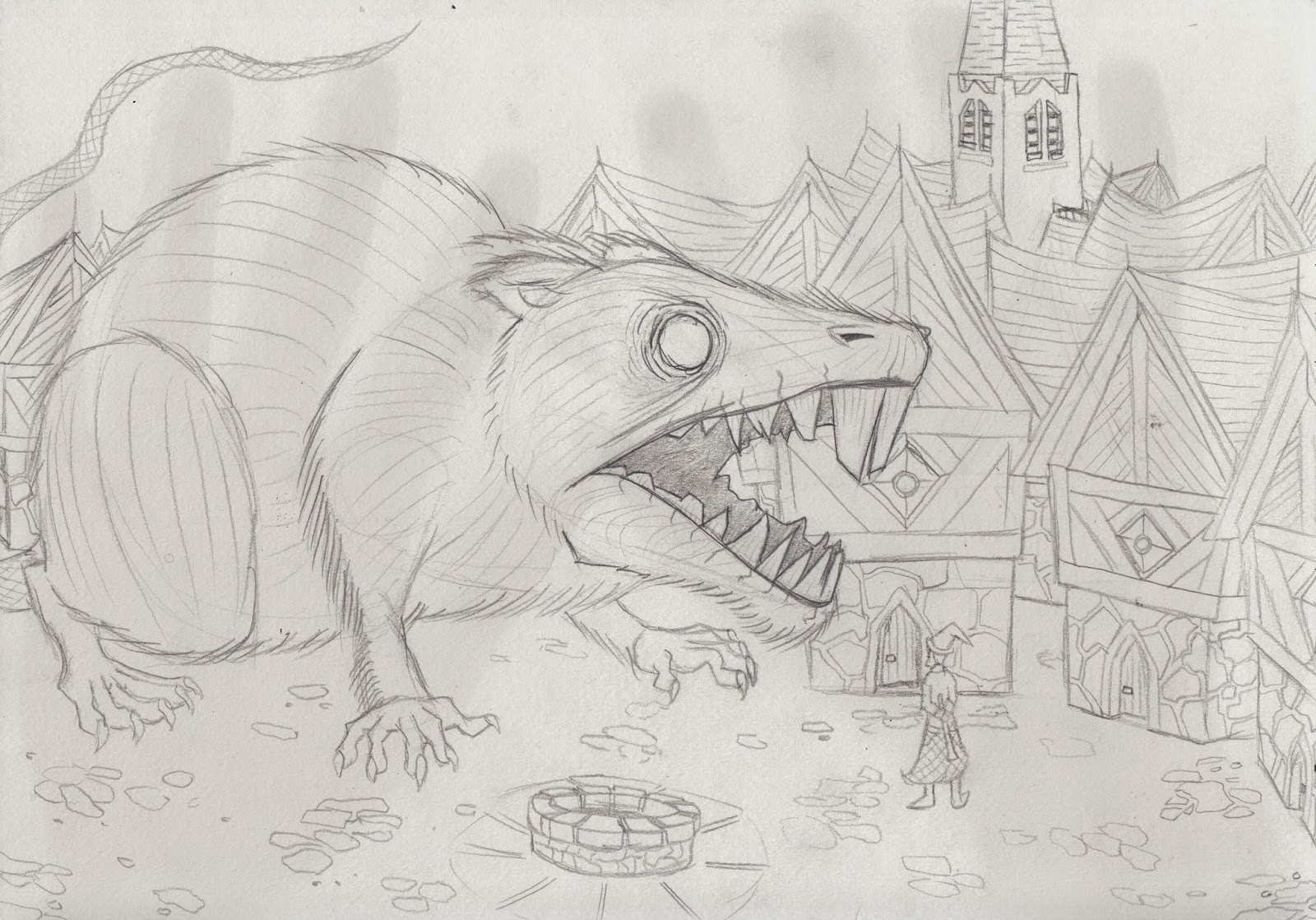
The next step here was to trace the pencil image with ink using a light pad and a dip pen, the same inking technique tat I had used when making the Edward Gorey copy.
During the inking process I did make a small error wit the sky. I thought that using a similar hatching tecnique that I used with the sky for the copy. Unfortunately, the cross hatching in the sky made the whole image look messy, and so I decided that I would have to edit the sky out using photoshop.

While in Photoshop, I made a few edits that were aimed at making the whole image seem real and add depth. I began by thresholding the image so that all of the black lines were clear and stood out. I then seperated the image of the Rat, Well and even the Piper from the rest of the image onto new layers. I then lowered the opacity of the the background layer containing the buildings in order to make them seem further away than the rest of the image. I also left the Well and Piper at high opacitys because they were both closer to the foreground and key features of the image.

The Edward Gorey style is now one of my favourte eerie rawing styles, and wil definetly play a part in my final piece.
Monday, 16 March 2015
Type Choice - My Designs
The digital calligraphy fonts found on Pinterest and Dafont Inspired me to get a calligraphy pen and some ink and attempt at giving the style a go myself. I started by drawing out the alphabet in both upper and lower case using the calligraphy pen.

By doing this I got a feel for using the calligraphy pen and decided to practace further by re-writing the title of the book, The Pied Piper. Unfortunately in the process I did make mistakes by accidentally switching words around, but when it came to editing later on, these mistakes were easily correctable.


By doing this I got a feel for using the calligraphy pen and decided to practace further by re-writing the title of the book, The Pied Piper. Unfortunately in the process I did make mistakes by accidentally switching words around, but when it came to editing later on, these mistakes were easily correctable.
This last image above it the style I was more or less aiming at, therefore it was the type I used when creating my final finished title.
When In photoshop I used the lasso tool to arrange the letters and words, I used the threshold edit to make the type darker and also the eraser tool to alter certain mistakes I had made with the calligraphy pen.
I also Placed the title into Adobe Illustrator in order to make much more detailed edits to the type that would make it look much more crisper and cleaner.
Once I had cleaned up the small mistakes in the lines of the title, I experimented around with some of the pre-set brush settings in Adobe Illustrator to see whether any of the brush effects would make it look any nicer.
Most of these brush effects worked well and made the title look rather rough and creepy in some cases. but it seemed to me that the titles lost their hand written charm and almost spoilt the effect i wanted. Therefor, I have decoded that I wont use one of these brush effects, and I will just use the plain title of the Pied Piper.
Tuesday, 10 March 2015
Type Choice - Digital
In order to find suitable digital type faces I created a Pin board on Pinterest where I can collect different designs of type that are of an interesting style and possibly fit my genre of work.
I came across a pin of a calligraphy type face that I felt was suitable for my own, so I went onto Dafont and searched for other calligraphy fonts.

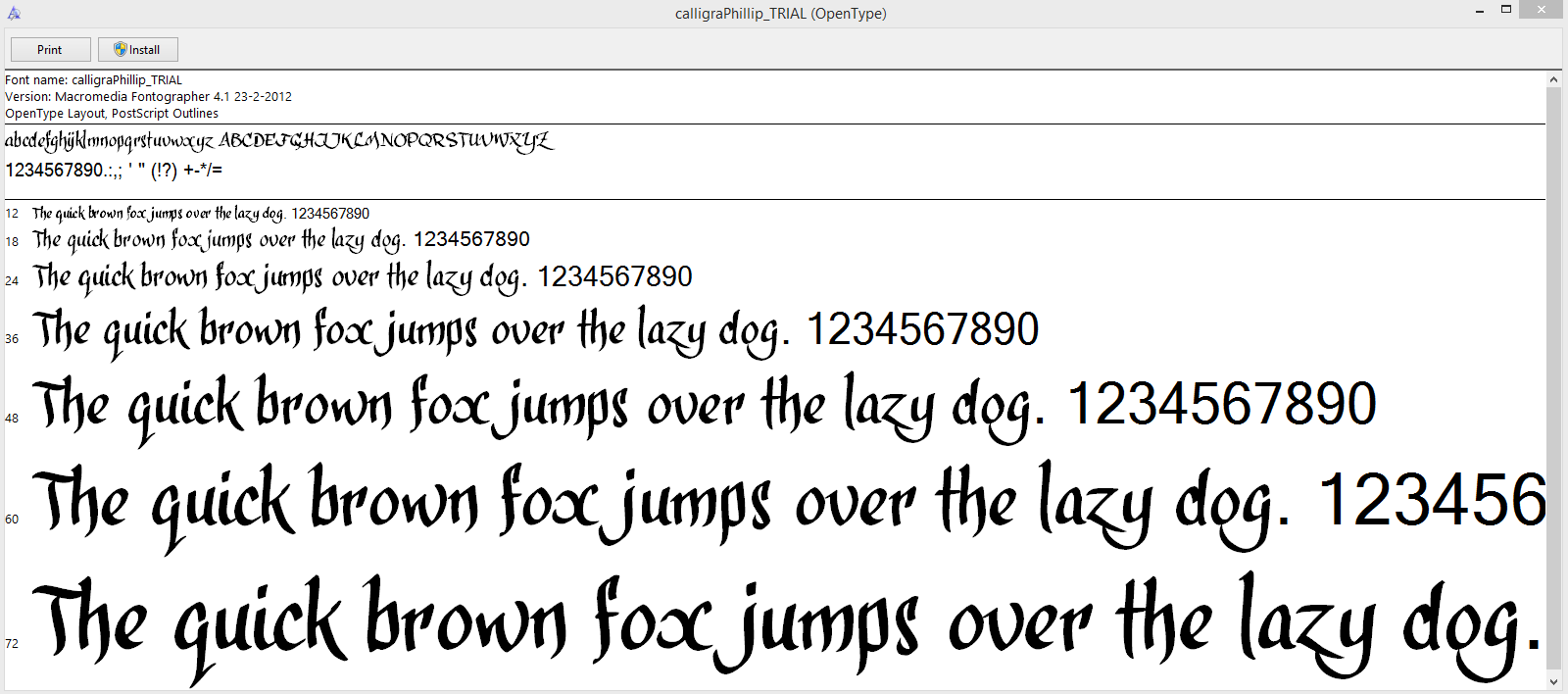
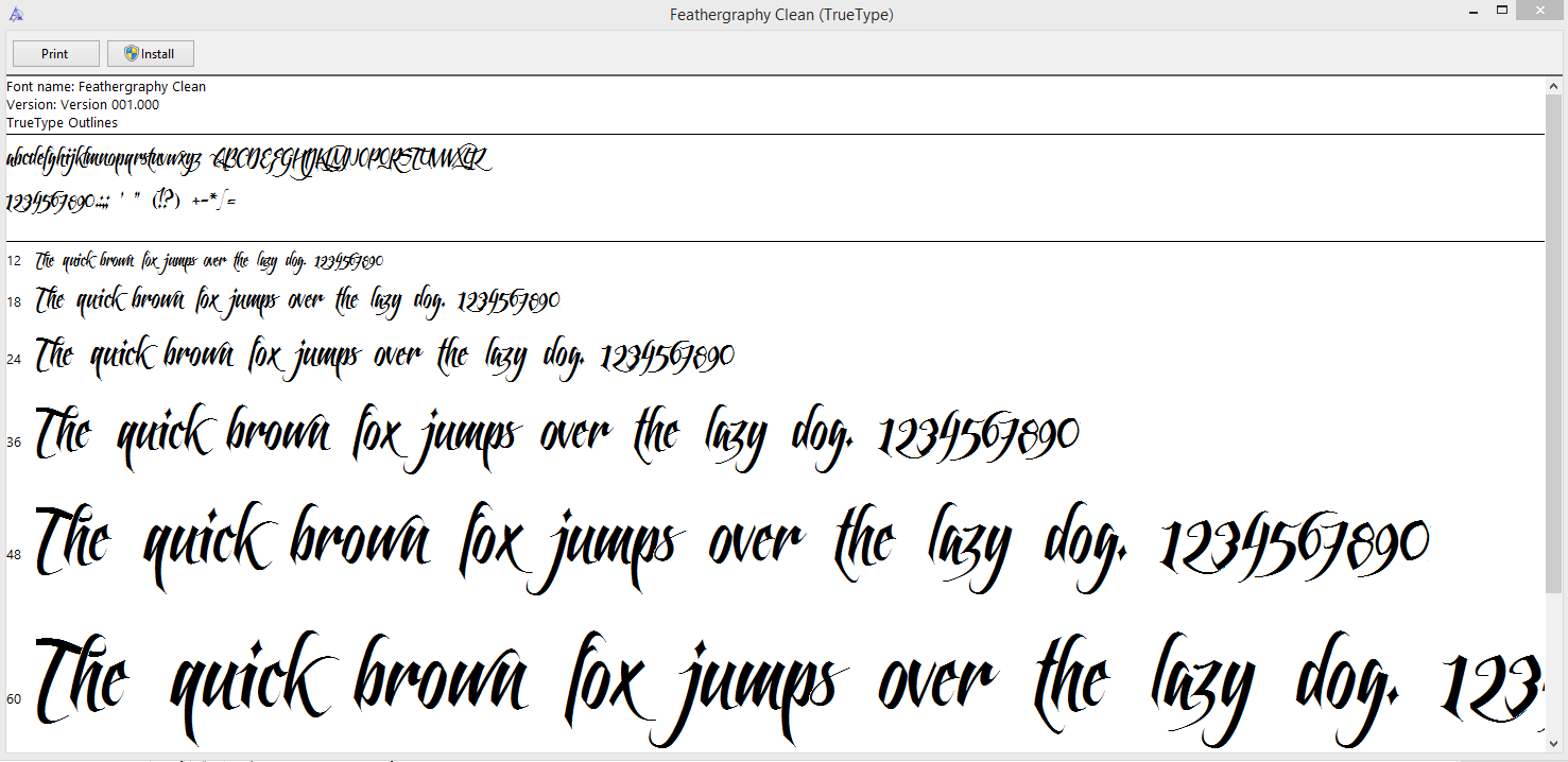
The fonts that I found on Dafont were:
Gourdie Cursive Deux
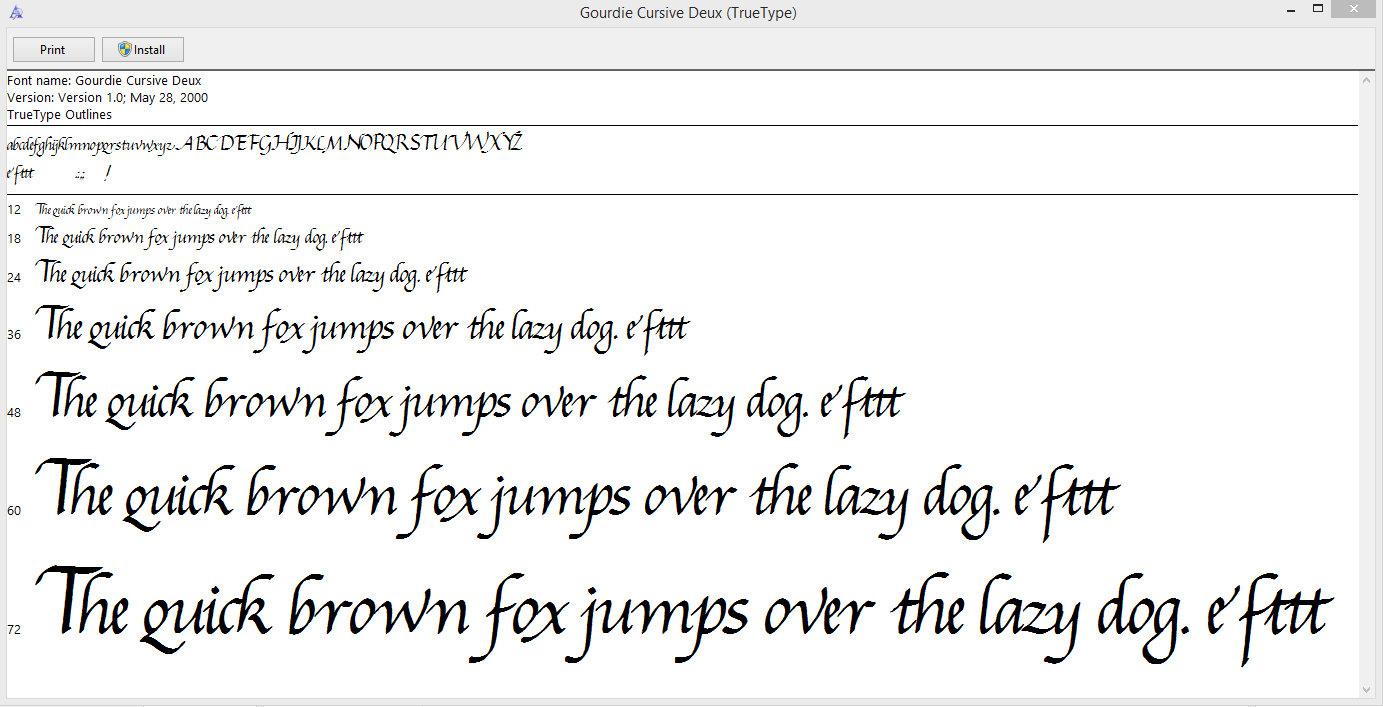
Last King Quest

CalligraPhillip
Feathergraphy
I will take aspects of these styles of font and apply them to my own style of font. A script typeface like this however is not suitable for body text in my book, therefore this typeface can only be used for the book title on the cover. I will use an Oldstyle font for the body text of my book, as it is a much easier typeface to read.
Subscribe to:
Comments (Atom)